
80% of the sensory information that reaches the brain is from our eyes. So, the best way to get somebody’s attention is to show them something.
That is why retail design is so important in stores. From lighting and layout to space and signs, every aspect of store design has the power to make or break your business.
Have you thought carefully about your store design and the overall space? If you work hard to make it the best it can be for your customers, it can transform their experience and hugely increase your sales.
Keep reading for a look at our retail design tips that can take your store to the next level.
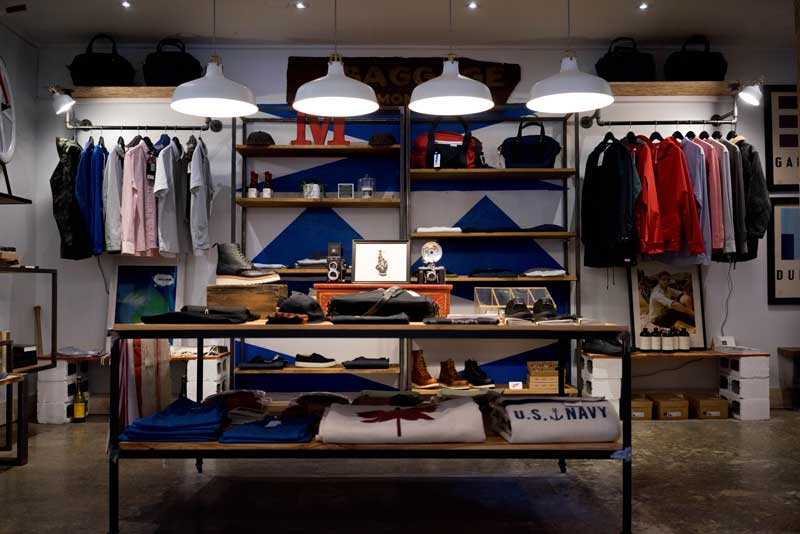
Create an Immersive Experience
A store isn’t just a building. The best retail store designs and shopfitting create an experience for customers. Your store should turn heads, attract attention and encourage people to engage with your brand.
When thinking about your retail design, ask yourself some questions. What does my brand stand for? What do I want my customers to think and feel?
What do I want my customers to remember? What do I want my customers to experience while they’re in your store?
You might know the answers to these questions straight away, or they may take a little more time to understand and summarise. Once you know your answers, you know what you’re aiming for in your store.
Your store design should do everything possible to create the experience that you want for your customers. That way, you’re selling more than products; you’re selling an experience.
Create a Purposeful Store Layout
Everything about your retail store should serve a purpose, and that includes the layout.
The way that your store is organised will guide your customers through it, showing them your products and what you are offering to them. You have the power to take your customers where you want them to go.
It’s a good idea to base your layout on natural patterns of behaviour. Studies show that shoppers tend to move in a counterclockwise pattern in Australia, the UK, and Japan. So, it might be best to organise your store to lead people in a leftward direction, as it will feel natural to them.
As you lead your customers through your store, give your products as much exposure as possible. Guide them towards your best-sellers, or the products that you’re aiming to increase sales of. That being said, be careful not to overwhelm your customers with your product promotion.
Avoid the Decompression Zone
The area inside the entrance of the store is known as the decompression zone. As customers step inside the door, this is where they are adjusting to their surroundings. They scan the store to judge if it’s somewhere that they’d like to look around further.
Don’t put too many items in the decompression zone. It is likely that customers will miss them, and it may feel overwhelming.
It’s a good idea to position your trolleys and baskets at the end of the decompression zone, inviting them to look around the store and make purchases. Make sure they’re big; when a customer fills their trolley or basket, they’ll feel the need to pay and leave rather than continue shopping. If the trolley or basket can hold more items, your customers are likely to purchase more items.
Include Breaks for Your Customers
If customers feel too overwhelmed by the products on display, they may rush through the store or leave altogether. Try to include breaks in your store design, which will allow your customers to slow down and engage with more of the items that you have on offer.
These breaks could be signs, displays, or empty space; somewhere that they don’t feel pressured to make a purchase.
If possible, try to include interactive breaks. This could be anything from a printed sign that asks a question, to a tablet that offers to help customers find what they’re looking for. The interactive element will ensure that they remain engaged with your brand, whilst allowing them to pause.
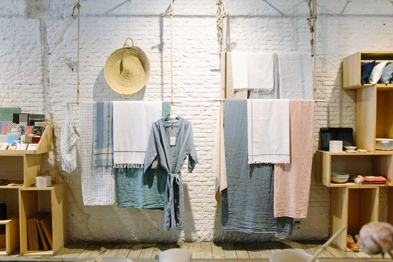
Less Is More
As we’ve mentioned, space in your store gives customers the time and room to fully appreciate the items that you have.
The same goes for the store overall. You don’t want it to feel cluttered, unorganised or claustrophobic.
Make sure that you have enough room for customers to move around the store freely. If the layout is too tight, or there are too many products blocking the way, customers may feel crowded and uncomfortable. Customers don’t want to bump into people or products.
If there is too much on display, customers may feel overwhelmed, and less likely to enter—or remain in—the store. If they think it will take too long to find what they’re looking for, they may not look at all.
Similarly, if the store looks unorganised this can reflect badly on your staff and your brand. If it looks like the staff doesn’t take time to organise products, why would the customer take the time to look at them?
Displays are essential to the design of a good store, but don’t let them take up too much of your customers’ space. They should add to their experience, not make it more difficult.
Try to ensure that they remain organised, neat and tidy. This will give a good impression of the store and those working in it, as well as making it easier for customers to clearly see the products on offer.
Think About Your Staple Items
Different types of stores have different staple items. These are the essentials that are most popular with buyers.
It’s important to get to know your customers and identify your store’s staple items. Once you know what these products are, you need to think carefully about where you position them in-store.
It’s popular to position your staple items as far away from the store entrance as possible. This is likely to increase the amount of time that they spend in-store.
In the meantime, you can direct them past many of your other products, using your store layout design. By giving exposure to these other items, you’re increasing the chance of further sales.
That being said, you don’t want to make your staple items difficult to find. This could frustrate customers and encourage them to go elsewhere for their products rather than searching through your store.
Remember to Include Your Impulse Items
Impulse items are products that a customer buys on a whim—they are not what they intended to purchase. They usually sell well in stores.
Scatter impulse items throughout the store, encouraging customers to pick them up and take home without too much consideration. Doing so discretely will make sure that customers don’t feel taken advantage of.
Also display your impulse items in the payment line, next to your checkouts. While they’re waiting in line, customers will have the time to look at the products and may feel compelled to buy one last thing.
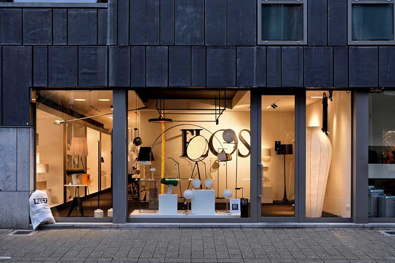
Use Focal Points in Your Store
Successful shopfitting ensures that each area of your store has a focal point. This is one thing that catches the attention of your customers and reflects the products on offer in that area. Ideally, the focal point will highlight the main product that you’re promoting in that space.
Positioning the main item at eye level will make it easier for customers to notice. Try to arrange complimentary items around it as once a customer has seen the main piece, they are more likely to explore its surroundings. That way, even if the customer doesn’t want to purchase the main item that you’re promoting, they may be encouraged to pick up other products.
Use Signs
Signs that are well designed and well-positioned catch people’s attention. If used correctly, they can enhance your displays and layout.
Signs should always have a purpose and complement your shoppers’ experience.
They typically highlight particular products and offers in-store. This can be done either directly or more discretely. It is best to experiment with different designs and messaging and monitor what your customers respond to most.
Purchasing, designing, and printing traditional signs can be quite costly. It may be best for your business to invest in digital signage, such as installing screens and tablets throughout the store. This is likely to be a bigger first payment, but designs are easily changed for a small price and could lead to long-term savings.
The specific designs and displays of signage are specific to each store and customer base. Experiment with your ideas, and find out which works best for you.
Encourage Your Customers to Take Photos
Today, technology and social media are extremely popular with customers and consumers. More often than not, experiences are captured, shared and promoted.
Make sure that the experience you’re offering is one that people want to share. Design your store and your displays in a way that encourages customers to take photographs and share them on their platforms.
The first step is making sure that your store looks great in photographs as well as in reality. Once you’re happy with your design, take photos and make sure that the space is photogenic. Take a look at what works for others, and consider how you could bring aspects of this into your own store.
You can also actively encourage customers to take photographs in-store. This can be done with your displays and signs, creating an environment for people to photograph themselves, the store, or your items. This also creates a break for shoppers as discussed earlier, which makes it more likely that they’ll engage with your products.
By making your store photogenic, you’re increasing the chances of customers sharing their images and experience with others. The people that see these images may well become future customers, increasing your sales.
Make Payment Easy
Make sure that your customers’ final experience in-store—payment—is as positive as possible. It is the most important area of the store, as it is where all sales are completed.
The tills should be positioned at the natural endpoint of your customers’ shopping experience. That way, you have encouraged them to explore all of the items on sale before reaching the natural exit of the store. This also means that the natural path throughout the store is not disrupted by the check-out area.
The exact position will be dependent on the design of your store, and unique to every business. Use your best judgement.
Try to install enough tills to ensure that customers can pay quickly and efficiently. The number of tills needed will depend on the size of your store and the number of customers that you’re aiming to attract. If you install too few check-out points, shoppers may choose not to purchase anything as they don’t want to wait in long queues.
Make sure that your check-out counters are big enough to allow shoppers to place their shopping, as well as their personal bags and items. You’ll also want to ensure that there is enough room around each customer that they don’t feel restricted or claustrophobic. You want the payment process to be as simple and efficient as possible.
It’s also important to install an effective, efficient and clear queuing system. You don’t want customers who are waiting to pay to become frustrated by the waiting process and leave rather than purchasing their items.
The Importance of Retail Design
Retail design is hugely important to the success of your business. The layout of your store, the positioning of your items, and the experience that you create for your customers all have a huge impact on your sales.
Get a free quote today if you’d like to follow these design tips and see your sales figures soar.